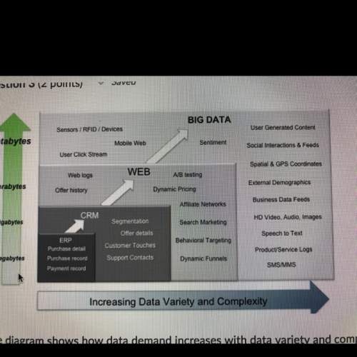
The diagram shows how data demand increases with data variety and complexity.
based on the ill...

Mathematics, 24.09.2019 04:30 gingerham1
The diagram shows how data demand increases with data variety and complexity.
based on the illustration, determine the correct order of data variety and complexity
from least to greatest.
web logs < dynamic funnels < sms/mms
sms/mms < gps coordinates < click stream
dynamic funnels < gps coordinates < mobile web
mobile web < speech to text < dynamic funnels

Answers: 3
Another question on Mathematics
Mathematics, 21.06.2019 16:00
While scuba diving, rajeev dove to a depth of 12.6 feet below the surface of the water and then descended another 8.7 feet. what expression can be used to find rajeev's new position? 12.6 – 8.7 –12.6 – 8.7 –12.6 – (–8.7) 12.6 – (–8.7)
Answers: 2
Mathematics, 21.06.2019 20:30
Cody was 165cm tall on the first day of school this year, which was 10% taller than he was on the first day of school last year.
Answers: 1
Mathematics, 21.06.2019 23:40
The frequency table shows the results of a survey asking people how many hours they spend online per week. on a piece of paper, draw a histogram to represent the data. then determine which answer choice matches the histogram you drew. in order here is the.. hours online: 0-3, 4-7, 8-11, 12-15, and 16-19. frequency: 5, 8, 10, 8, 7 answer for the question is in the picture! : )
Answers: 2
Mathematics, 22.06.2019 00:00
Can someone me with this? i’m not sure what to put for my equations.
Answers: 2
You know the right answer?
Questions


Computers and Technology, 20.03.2020 16:24

History, 20.03.2020 16:24
SAT, 20.03.2020 16:25


Mathematics, 20.03.2020 16:25

Mathematics, 20.03.2020 16:26

Social Studies, 20.03.2020 16:27
Mathematics, 20.03.2020 16:27
Physics, 20.03.2020 16:27
English, 20.03.2020 16:27


