
Mathematics, 26.01.2020 07:31 zozo72
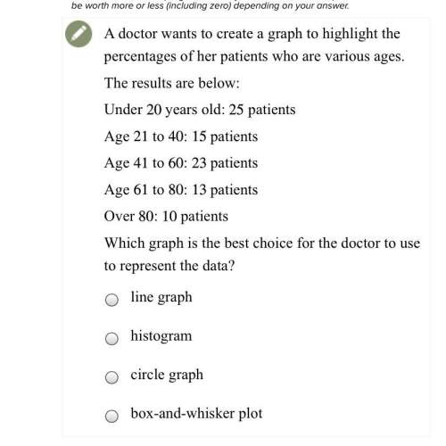
Adoctor wants to create a graph to highlight the percentages of her patients who are various ages.
the results are below:
under 20years old: 25patients
age 21 to 40: 15patients
age 41 to 60: 23patients
age 61 to 80: 13patients
over 80: 10 patients
which graph is the best choice for the doctor to use to represent the data?
a. line graph
b. histogram
c. circle graph
d. box-and-whisker plot

Answers: 2
Another question on Mathematics
Mathematics, 21.06.2019 15:00
What are the relative frequencies to the nearest hundredth of the columns of the two-way table? a b group 1 102 34 group 2 18 14
Answers: 1
Mathematics, 21.06.2019 18:00
!! 10 ! a westbound jet leaves central airport traveling 635 miles per hour. at the same time, an eastbound plane departs at 325 miles per hour. in how many hours will the planes be 1900 miles apart?
Answers: 1
Mathematics, 21.06.2019 20:40
What is the value of the expression i 0 × i 1 × i 2 × i 3 × i 4? 1 –1 i –i
Answers: 2
Mathematics, 21.06.2019 23:00
Which statement accurately explains whether a reflection over the y axis and a 270° counterclockwise rotation would map figure acb onto itself?
Answers: 1
You know the right answer?
Adoctor wants to create a graph to highlight the percentages of her patients who are various ages.
Questions

History, 23.12.2019 02:31

Arts, 23.12.2019 02:31
Mathematics, 23.12.2019 02:31


History, 23.12.2019 02:31
Social Studies, 23.12.2019 02:31
Social Studies, 23.12.2019 02:31

English, 23.12.2019 02:31


Computers and Technology, 23.12.2019 02:31

Chemistry, 23.12.2019 02:31
Biology, 23.12.2019 02:31


