Which of the following statements best explains how the graphs misrepresent the data?
a...

Mathematics, 26.01.2020 07:31 redbeast677
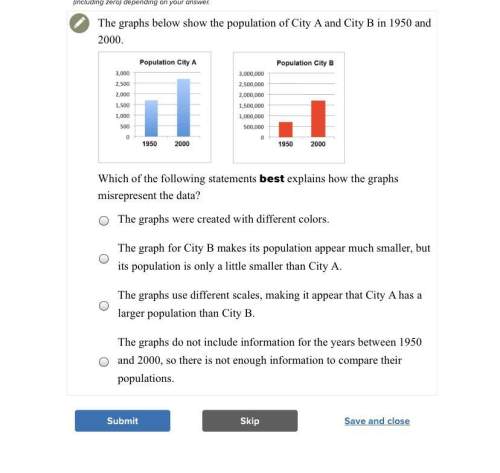
Which of the following statements best explains how the graphs misrepresent the data?
a. the graphs were created with different colors.
b. the graph for city b makes its population appear much smaller, but its population is only a little smaller than city a.
c. the graphs use different scales, making it appear that city a has a larger population than city b.
d. the graphs do not include information for the years between 1950 and 2000, so there is not enough information to compare their populations.

Answers: 2
Another question on Mathematics
Mathematics, 21.06.2019 13:30
Franklin neason earns $5,250 a month as a sales manager. what is his semimonthly salary? a.$10,500b.$5,250c.$2,365d.$2,625
Answers: 1
Mathematics, 21.06.2019 18:40
The vertex of this parabola is at (-2,-3). when the x-value is -1, the y-value is -5. what is the coefficient of the squared expression in the parabola's equation?
Answers: 2
Mathematics, 21.06.2019 19:00
Acompany that manufactures and sells guitars made changes in their product range. from the start they had 20 models. then they reduced the number of models to 15. as a result, the company enjoyed a 10% increase in turnover. - how much did the stock level change? in (%)
Answers: 2
You know the right answer?
Questions

History, 17.09.2019 12:30


History, 17.09.2019 12:30
Mathematics, 17.09.2019 12:30
Mathematics, 17.09.2019 12:30
History, 17.09.2019 12:30

Biology, 17.09.2019 12:30
Social Studies, 17.09.2019 12:30

Chemistry, 17.09.2019 12:30


