
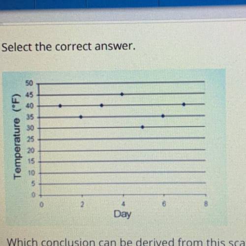
Which conclusion can be derived from this scatter plot?
A.
The average temperature increased...

Mathematics, 03.12.2020 21:40 hillmarilyn70pe8sy6
Which conclusion can be derived from this scatter plot?
A.
The average temperature increased from day 1 through day 5.
B.
The average temperature increased from day 5 through day 7.
С.
The average temperature decreased from day 2 through day 5.
OD
The average temperature decreased from day 4 through day 6.

Answers: 2
Another question on Mathematics
Mathematics, 21.06.2019 20:00
Choose the linear inequality that describes the graph. the gray area represents the shaded region. a: y ≤ –4x – 2 b: y > –4x – 2 c: y ≥ –4x – 2 d: y < 4x – 2
Answers: 2
Mathematics, 22.06.2019 01:00
First work with stencil one. use a combination of reflections, rotations, and translations to see whether stencil one will overlap with the original pattern. list the sequence of rigid transformations you used in your attempt, noting the type of transformation, the direction, the coordinates, and the displacement in
Answers: 3
Mathematics, 22.06.2019 01:20
1. why is a frequency distribution useful? it allows researchers to see the "shape" of the data. it tells researchers how often the mean occurs in a set of data. it can visually identify the mean. it ignores outliers. 2. the is defined by its mean and standard deviation alone. normal distribution frequency distribution median distribution marginal distribution 3. approximately % of the data in a given sample falls within three standard deviations of the mean if it is normally distributed. 95 68 34 99 4. a data set is said to be if the mean of the data is greater than the median of the data. normally distributed frequency distributed right-skewed left-skewed
Answers: 2
Mathematics, 22.06.2019 02:00
Pleasseee important quick note: enter your answer and show all the steps that you use to solve this problem in the space provided. use the circle graph shown below to answer the question. a pie chart labeled favorite sports to watch is divided into three portions. football represents 42 percent, baseball represents 33 percent, and soccer represents 25 percent. if 210 people said football was their favorite sport to watch, how many people were surveyed?
Answers: 2
You know the right answer?
Questions

English, 18.09.2020 05:01

Biology, 18.09.2020 05:01

Social Studies, 18.09.2020 05:01
English, 18.09.2020 05:01
Mathematics, 18.09.2020 05:01
Mathematics, 18.09.2020 05:01
English, 18.09.2020 05:01
Mathematics, 18.09.2020 05:01
Mathematics, 18.09.2020 05:01
Mathematics, 18.09.2020 05:01
Mathematics, 18.09.2020 05:01
Mathematics, 18.09.2020 05:01
Mathematics, 18.09.2020 05:01
Mathematics, 18.09.2020 05:01
Mathematics, 18.09.2020 05:01
English, 18.09.2020 05:01
Mathematics, 18.09.2020 05:01
Mathematics, 18.09.2020 05:01

Spanish, 18.09.2020 05:01
Mathematics, 18.09.2020 05:01


