
Mathematics, 12.01.2021 20:10 emocow
1)
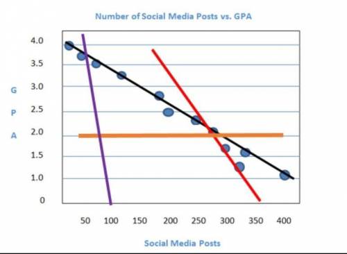
The scatterplot shows the relationship between the number of texts a student sends each week and the student's GPA. Which color is the line of best fit for the data points?
A) red
B) purple
C) black
D) orange
2)
Which should you consider when informally assessing whether a line is the best fit for the data on a scatter plot?
A) the range of the data points
B) the median of the data points
C) the outliers of the data points
D) the closeness of the data points

Answers: 1
Another question on Mathematics
Mathematics, 20.06.2019 18:04
Andy is making a design using ice cream sticks that are 4 and 1/2 in long he wants this long side of his designed to be no longer than 24 inches what is the greatest number of sticks that any can use on his long side of his design
Answers: 1
Mathematics, 21.06.2019 19:30
Now max recorded the heights of 500 male humans. he found that the heights were normally distributed around a mean of 177 centimeters. which statements about max’s data must be true? a) the median of max’s data is 250 b) more than half of the data points max recorded were 177 centimeters. c) a data point chosen at random is as likely to be above the mean as it is to be below the mean. d) every height within three standard deviations of the mean is equally likely to be chosen if a data point is selected at random.
Answers: 1
Mathematics, 21.06.2019 20:00
The two square pyramids are similar. find the total volume of both pyramids if the ratio of their surface areas is 9/16
Answers: 3
You know the right answer?
1)
The scatterplot shows the relationship between the number of texts a student sends each week and...
Questions


Mathematics, 28.10.2019 05:31


Mathematics, 28.10.2019 05:31

Advanced Placement (AP), 28.10.2019 05:31

History, 28.10.2019 05:31


