
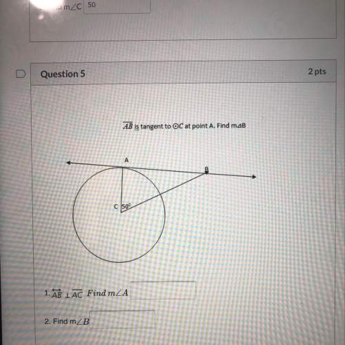
Mathematics, 13.04.2021 20:30 Teephat
Meg plotted the graph below to show the relationship between the temperature of her city and the number of sweaters sold at a store:
Main title on the graph is Sweater Sale. Graph shows 0 to 30 on x axis at increments of 5 and 0 to 12 on y axis at increments of 1. The label on the x axis is Temperature in degree C, and the label on the y axis is Number of Sweaters Sold. Dots are made at the ordered pairs 0, 12 and 2.5, 10 and 2.5, 11 and 5, 10 and 7.5, 9 and 7.5, 10 and 10, 7 and 12.5, 6 and 12.5, 8 and 15, 4 and 15, 7 and 17.5, 5 and 20, 1 and 20, 3 and 22.5, 9 and 25, 1 and 27.5, 1.
Describe how you can make the line of best fit. Write the approximate slope and y-intercept of the line of best fit. Show your work, including the points that you use to calculate slope and y-intercept. (5 points)

Answers: 2
Another question on Mathematics
Mathematics, 21.06.2019 22:00
Find the greatest common factor of the followig monomials 46g^2h and 34g^6h^6
Answers: 1
Mathematics, 21.06.2019 22:30
Need same math paper but the back now i hope your able to read it cleary i need with hw
Answers: 1
Mathematics, 22.06.2019 01:00
What is the slope of the line? a. -5/2 b.2/5 c. 5/2 d.7/2
Answers: 1
You know the right answer?
Meg plotted the graph below to show the relationship between the temperature of her city and the num...
Questions
Mathematics, 18.03.2021 08:10
Mathematics, 18.03.2021 08:10


Mathematics, 18.03.2021 08:10

English, 18.03.2021 08:10
Mathematics, 18.03.2021 08:10
Mathematics, 18.03.2021 08:10

History, 18.03.2021 08:10
Mathematics, 18.03.2021 08:10
English, 18.03.2021 08:10

Biology, 18.03.2021 08:10
Mathematics, 18.03.2021 08:10

Geography, 18.03.2021 08:10
Physics, 18.03.2021 08:10


