
Mathematics, 04.02.2020 06:57 dani19cano
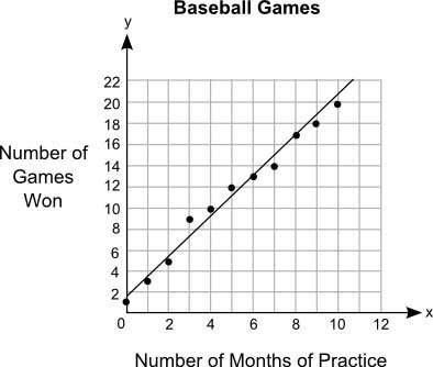
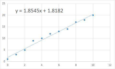
The graph shows the relationship between the number of months different students practiced baseball and the number of games they won:
the title of the graph is baseball games. on x axis, the label is number of months of practice. on y axis, the label is number of games won. the scale on the y axis is from 0 to 22 at increments of 2, and the scale on the x axis is from 0 to 12 at increments of 2. the points plotted on the graph are the ordered pairs 0, 1 and 1, 3 and 2, 5 and 3, 9 and 4, 10 and 5, 12 and 6, 13 and 7, 14 and 8,17 and 9, 18 and 10,20. a straight line is drawn joining the ordered pairs 0, 1.8 and 2, 5.6 and 4, 9.2 and 6, 13 and 8, 16.5 and 10, 20.5.
part a: what is the approximate y-intercept of the line of best fit and what does it represent? (5 points)
part b: write the equation for the line of best fit in slope-intercept form and use it to predict the number of games that could be won after 13 months of practice. show your work and include the points used to calculate the slope. (5 points)

Answers: 2
Another question on Mathematics
Mathematics, 20.06.2019 18:04
Working on itts i’m going to need you to me as i go along 1-5
Answers: 1
Mathematics, 21.06.2019 14:00
Ms. sutton recorded the word counts and scores of the top ten essays in a timed writing contest. the table shows her data. how does the word count of an essay relate to its score in the contest? word count tends to decrease as the score decreases. word count tends to increase as the score decreases. word count tends to remain constant as the score decreases. word count has no apparent relationship to the score of the essay.
Answers: 1
Mathematics, 21.06.2019 15:30
The length of each stair is 11 inches. what is the rise, r, for each stair? round to the nearest inch. 2 inches 7 inches 17 inches 24 inches
Answers: 3
Mathematics, 21.06.2019 16:00
The scatter plot graph shows the average annual income for a certain profession based on the number of years of experience which of the following is most likely to be the equation of the trend line for this set of data? a. i=5350e +37100 b. i=5350e-37100 c. i=5350e d. e=5350e+37100
Answers: 1
You know the right answer?
The graph shows the relationship between the number of months different students practiced baseball...
Questions

English, 10.12.2020 05:00
Mathematics, 10.12.2020 05:00

Biology, 10.12.2020 05:00
Mathematics, 10.12.2020 05:00

Mathematics, 10.12.2020 05:00


Mathematics, 10.12.2020 05:00
Mathematics, 10.12.2020 05:00


