
Mathematics, 14.05.2021 21:20 liddopiink1
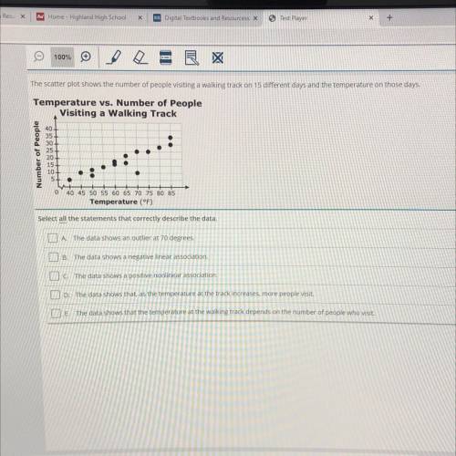
The scatter plot shows the number of people visiting a walking track on 15 different days and the temperature on those days.
Temperature vs. Number of People
Visiting a Walking Track
40
35
30
25
20
15
10+
5+
0
40 45 50 55 60 65 70 75 80 85
Temperature (°F)
Select all the statements that correctly describe the data.
A. The data shows an outlier at 70 degrees.
B. The data shows a negative linear association.
C. The data shows a positive nonlinear association.
D. The data shows that, as the temperature at the track increases, more people visit.
E. The data shows that the temperature at the walking track depends on the number of people who visit.

Answers: 1
Another question on Mathematics
Mathematics, 21.06.2019 21:00
The radius of a sphere is 3 inches. which represents the volume of the sphere?
Answers: 1
Mathematics, 21.06.2019 21:30
Are the corresponding angles congruent? explain why or why not.
Answers: 2
Mathematics, 21.06.2019 23:30
Ateacher wanted to buy a chair, a bookshelf, two tables and a desk. she spent $900 for all five items and the chair and the desk combined 70% of her total. if the bookshelf cost $50, how much did each of the tables cost?
Answers: 1
You know the right answer?
The scatter plot shows the number of people visiting a walking track on 15 different days and the te...
Questions
Mathematics, 22.12.2020 03:40

Mathematics, 22.12.2020 03:40

World Languages, 22.12.2020 03:40

Computers and Technology, 22.12.2020 03:40


History, 22.12.2020 03:40

Social Studies, 22.12.2020 03:40
Mathematics, 22.12.2020 03:40
Mathematics, 22.12.2020 03:40

Biology, 22.12.2020 03:40
Social Studies, 22.12.2020 03:40
Mathematics, 22.12.2020 03:40

History, 22.12.2020 03:40


