
Mathematics, 20.05.2021 06:00 alexandroperez13
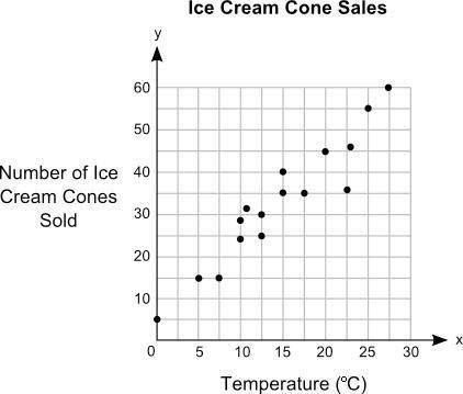
Jack plotted the graph below to show the relationship between the temperature of his city and the number of ice cream cones he sold daily: Main title on graph is Ice Cream Cone Sale. Graph shows 0 to 30 on x axis at increments of 5 and 0 to 60 on y axis at increments of 10. The label on the x axis is Temperature in degree C, and the label on the y axis is Number of Ice Cream Cones Sold. Dots are made at the ordered pairs 0, 5 and 5, 15 and 7.5, 15 and 10, 24 and 10, 28 and 12, 32 and 12.5, 25 and 12.5, 30 and 15, 35 and 15, 40 and 17.5, 35 and 20, 45 and 22.5, 36 and 23, 46 and 25, 55 and 27.5, 60.
Part A: In your own words, describe the relationship between the temperature of the city and the number of ice cream cones sold. (5 points)
Part B: Describe how you can make the line of best fit. Write the approximate slope and y-intercept of the line of best fit. Show your work, including the points that you use to calculate slope and y-intercept. (5 points)

Answers: 3

Another question on Mathematics
Mathematics, 21.06.2019 14:30
Which system of linear inequalities is represented by the graph?
Answers: 2
Mathematics, 21.06.2019 16:30
Which of the following is the correct ratio for converting kilograms to grams
Answers: 3
Mathematics, 21.06.2019 19:00
Give me the equations of two lines that have the same slope but are not parallel.
Answers: 3
Mathematics, 22.06.2019 00:20
Which shows how to solve the equation 3/4x=6 for x in one step?
Answers: 2
You know the right answer?
Jack plotted the graph below to show the relationship between the temperature of his city and the nu...
Questions

Biology, 20.12.2019 02:31

History, 20.12.2019 02:31
Mathematics, 20.12.2019 02:31

Computers and Technology, 20.12.2019 02:31
Biology, 20.12.2019 02:31

French, 20.12.2019 02:31
History, 20.12.2019 02:31

Spanish, 20.12.2019 02:31

English, 20.12.2019 02:31

English, 20.12.2019 02:31
Mathematics, 20.12.2019 02:31


